
This poster is taken from Kerrang! It helps us understand what a poster for the genre of Pop-Rock usually looks like. The poster is simple yet affective, which we like. We have also found that all Music Adverts have dates of when the CD Didgipak and song are being released, so we are looking into what font this could be.
Another poster that we have been looking at is Gwen Stafani With this poster we liked how it was eligent yet a bit rock and roll. We also liked the fact that it contained aspects of the colour pink. Looking at this got us thinking about how we could add a bit more rock and roll into our poster to show that P!NK is more rock and roll than the colour pink, which is stereotypically associated with girls.
After we looked at two different adverts of different artists we decided it'll be best if we looked at some adverts from P!NK herself so that we can see what distiguinsh P!NK for who she is, however we found it very hard to find at least one advert fir the artists, so we decided to look at P!nk posters instead to see if we an get osme ideas of these, some of the posters we found were,
This is a poster from one of P!NK's tours. When we saw this we thought of how it was like Gwen Stafanis advert it had a bit of rock element in it, so we thought that we should definatly have the rock elemnet within our advert.
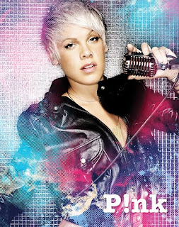
This is another good poster that is really colourfull and it stands out alot, and also you can tell that it is pink.
No comments:
Post a Comment